Here is my POST-MORTEM about «NINDASH: Skull Valley», my first mobile game experience.
GENESIS:
Adrien Bariau, young game-designer almost at termination, showed his student game prototype METEOR DASH to Tot, the ANKAMA’s Boss. He requested advices to Loïc Roger, an Ankama veteran who recently created a game development cell in the studio and initiated some cool mobile games as KING TONGUE and DRAG’n’BOOM. Loïc told Adrien his prototype wasn’t very “sexy” and would need some visual assets to draw attention on his project. He thought about me, as I’m also an Ankama veteran, with more than 10 years of work as a game artist/illustrator.
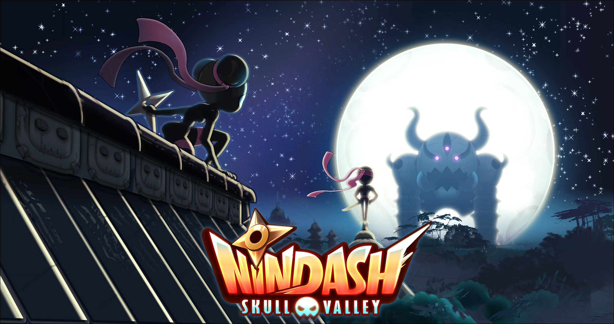
METEOR TO NINJAS!
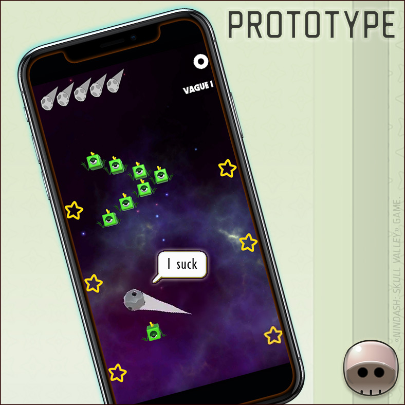
METEOR DASH gameplay was pretty simple. The first game prototype was about a meteore striking strange creatures in the space. I told Adrien no one would incarnate this kind of Meteore (it would be more sexy in a 3D simulation).
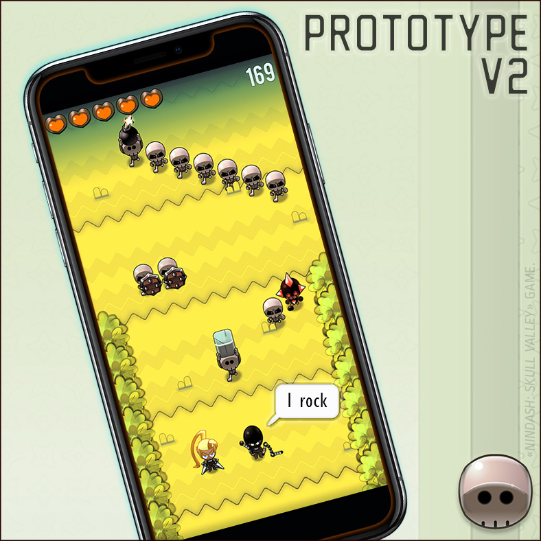
I spent a few evenings creating a new mobile-game friendly art direction. I decided to work on a more dynamic character. The meteor trail inspired me a dashing Ninja!
GAMEPLAY TRAILER:
Before going into details, let’s discover the gameplay trailer of our game.
THE DEAL & THE TEAM
After having seen the first visual intentions, Tot gave us the go-ahead and let us free to do what we wanted, as long as we created the game with a core-team of 3 in only 3 months. The team was composed of: Adrien BARIAU (Game-design), Thomas BARON (Development) and I (Art direction).
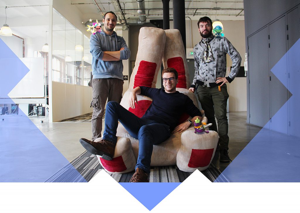
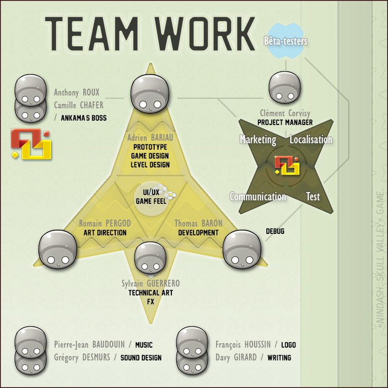
Of course, creating a game is a teamwork. We had the support of a few ANKAMA talents in various skills as visual effects, sound design, music, logotype, etc. We also benefited from the test, localization, communication, marketing poles expertise… Not to mention our super beta-testers!
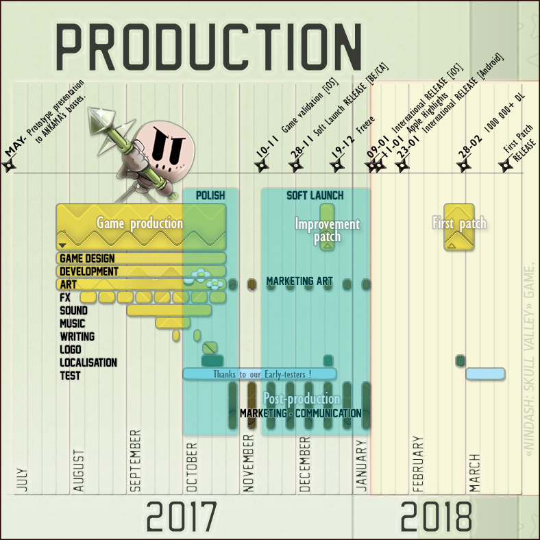
The production lasted for three months, the 3 of us worked full-time on the game, including one month entirely devoted to its ‘polish’. Then, we waited three additional months until the release. We decided to leave first a ‘Soft launch’ period that made it possible for us to work on various game tests, adjustments, patches… And also on next games prototypes!
CHERRY TREES, BONSAI & GRAVES.
Now, let’s speak about art!
For my first mobile game experience, I wanted to create a world easily accessible to everybody!↓
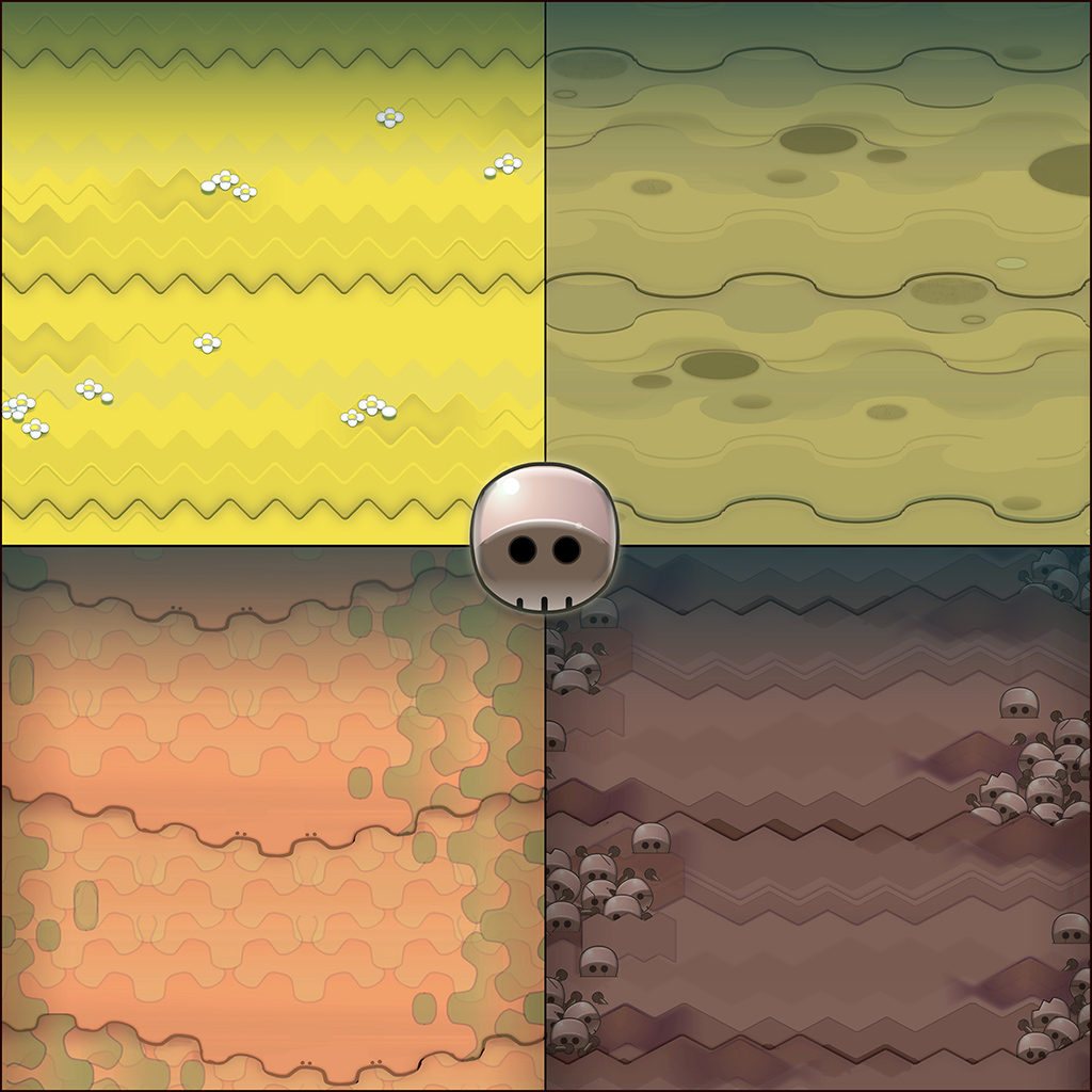
My first steps were to define ground patterns. It’s a good way for starting: think about first colors, moods and shapes.
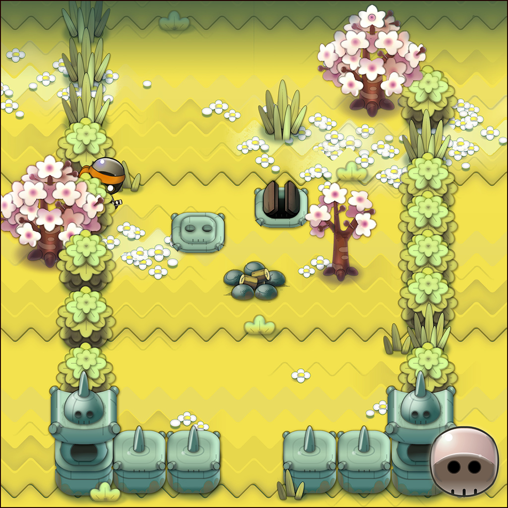
I wanted to create a stylized, colorful and efficient art direction. I focused on the first environment: I defined background assets like plants, trees, walls or other video game basics.
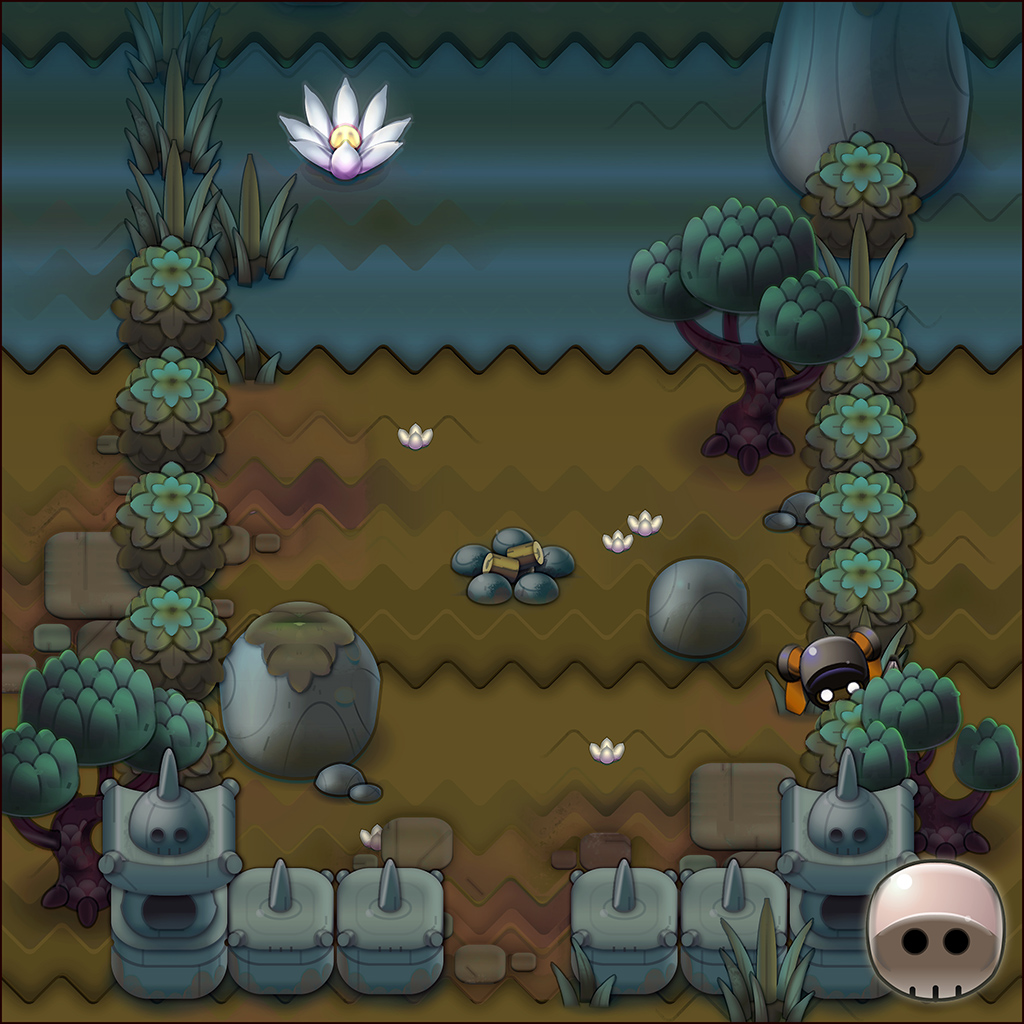
As I’m a clever boy, I decided the second one would be an evolution of the first one. However it’s not magical and still took time to change all previous assets.
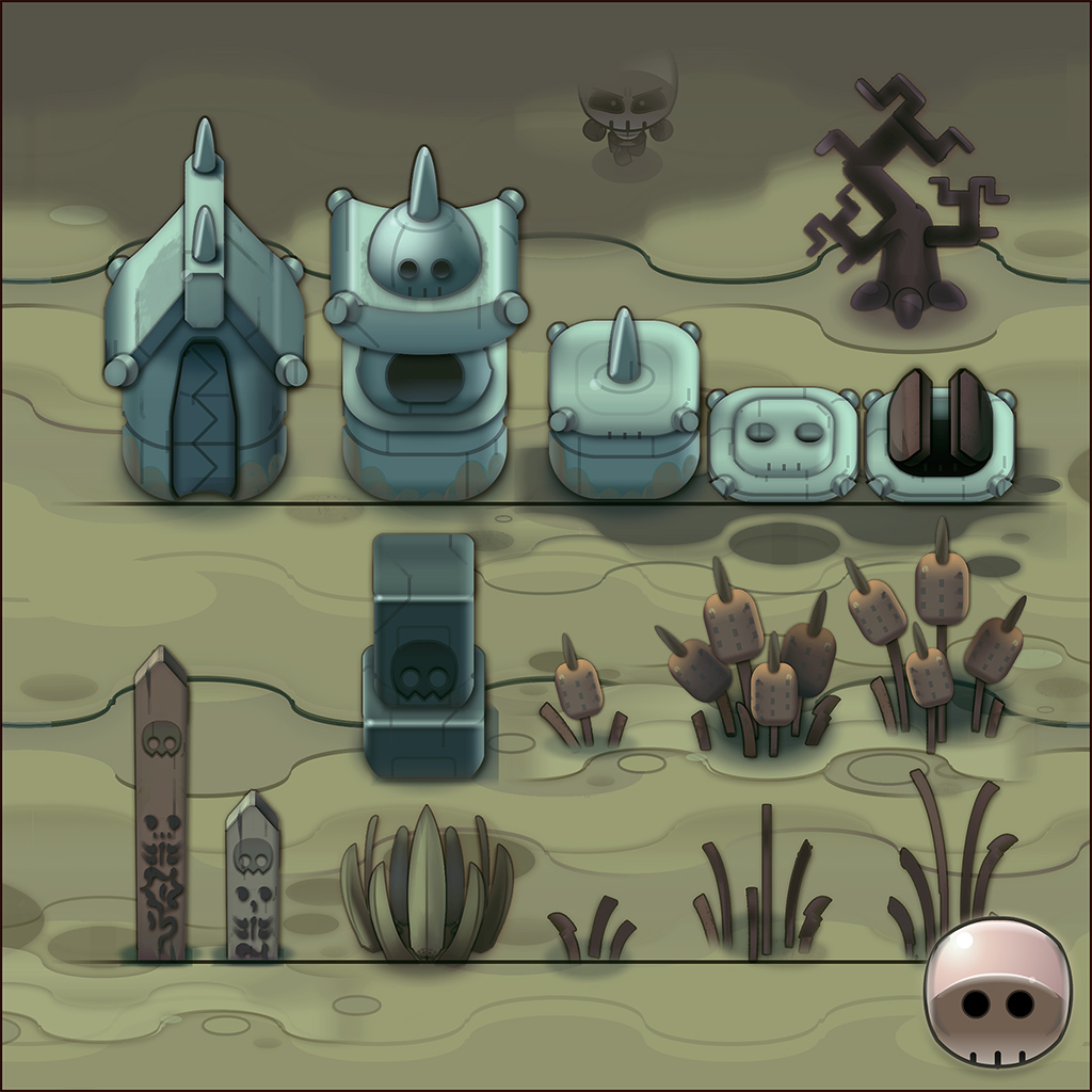
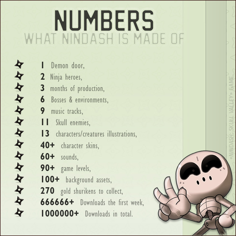
Finally, I created 6 different worlds. 15 to 25 background assets were designed for each of them; that represents more than one hundred for the entire game.
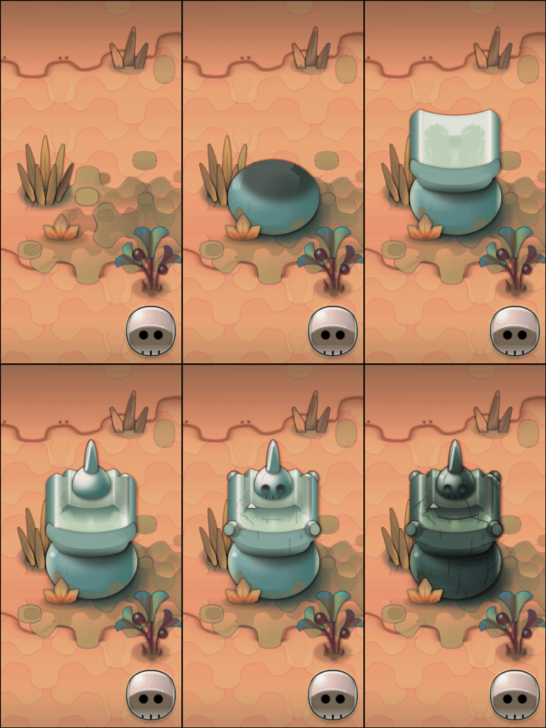
I’m used to using Adobe Photoshop software to design my graphics, even if it looks like vector art, a legacy of my past years of work in ANKAMA studio.
↓ I use basic selections, gradients and layer styles (Stroke, Glow, Shadow…). Then, I export each graphic in.PNG file.
One of my main references was Zelda Minish Cap, even if I never played the game.
NINJA & SHURIKEN.
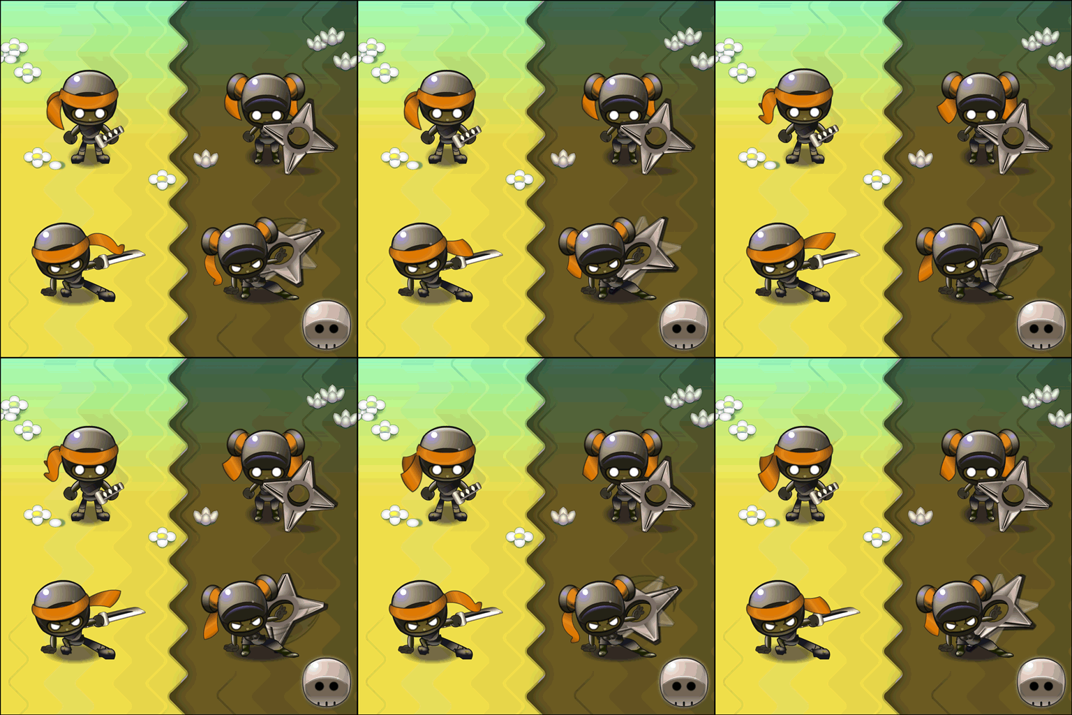
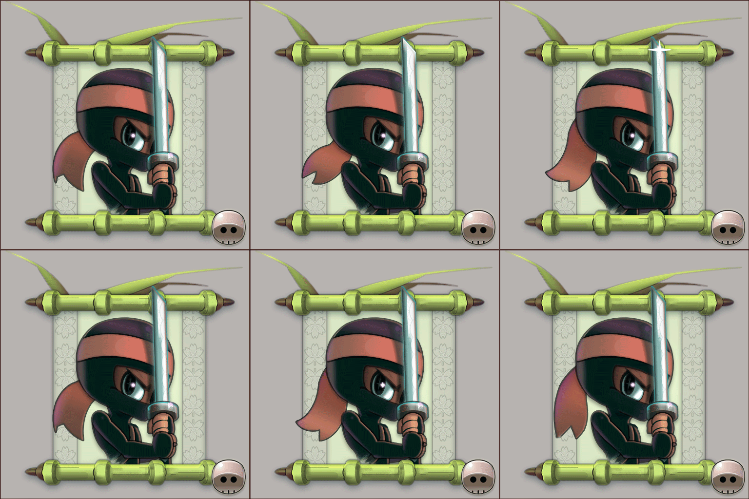
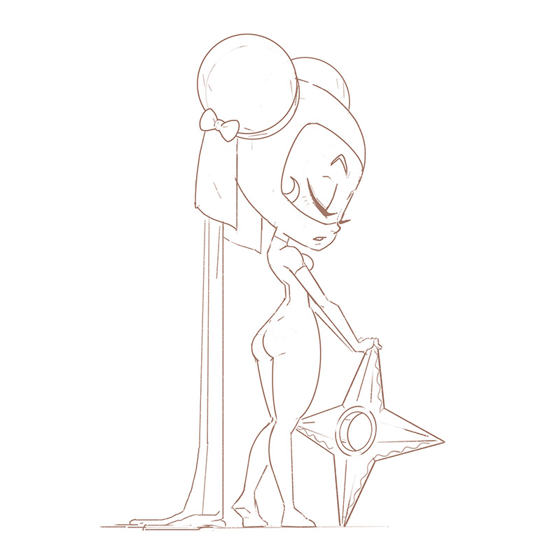
From the very beginning, I wanted to create two main characters: a male and a female. I started by reworking the shitty ninja of our prototype: I enlarged the size of his head and added white dots eyes for a better clarity on small on mobile devices.
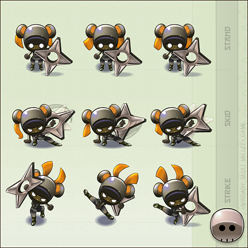
Then, I defined character actions in conjunction with the gameplay. DASH (1 frame), STAND, SKID & STRIKE (3 frames). I chose efficient and cut animation style, keeping the minimum of frames
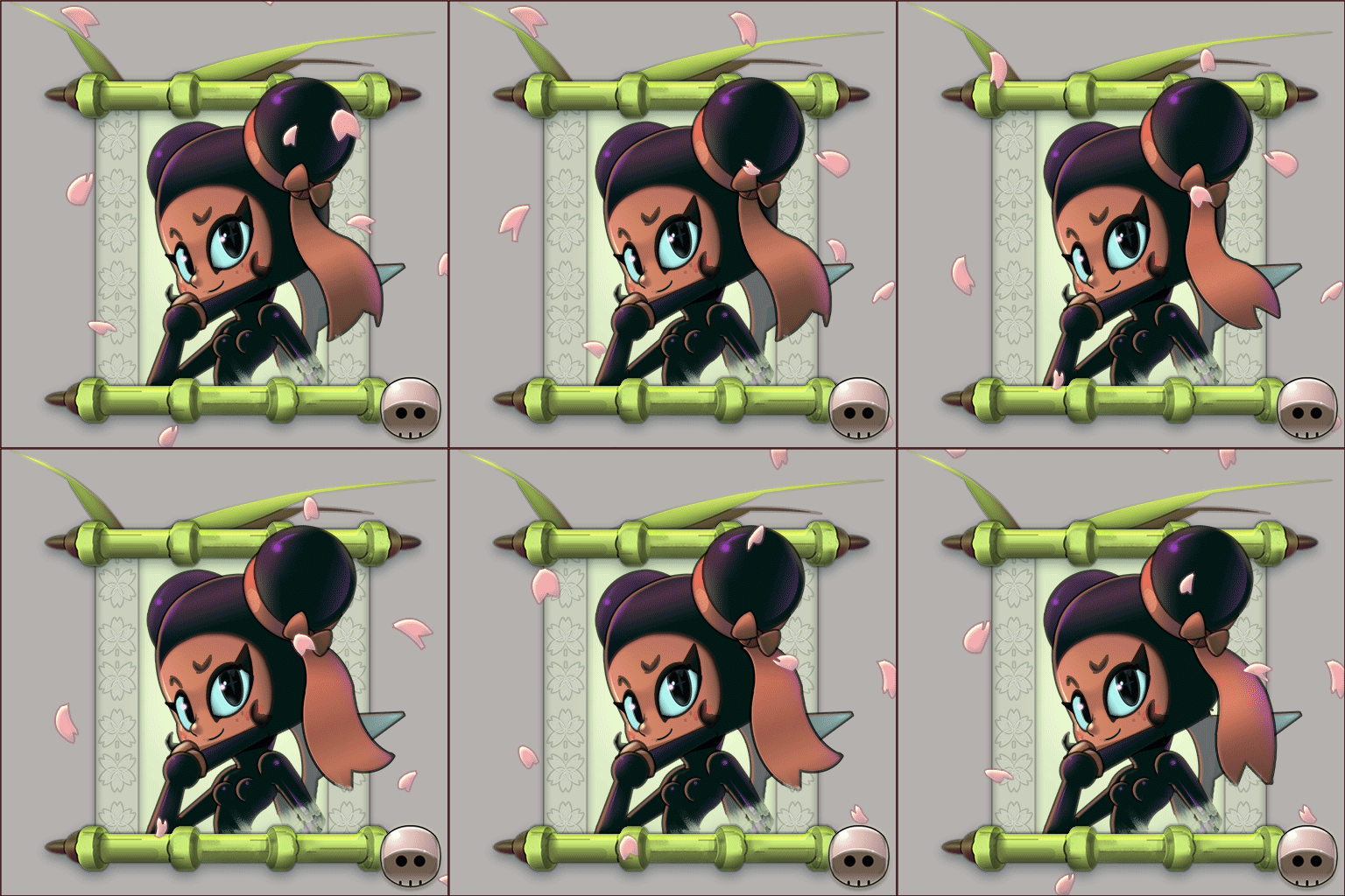
As we only had three months and since I was alone to design all the game assets, I created a very efficient and stylized 2D art style, inspired by some manga as Megaman.
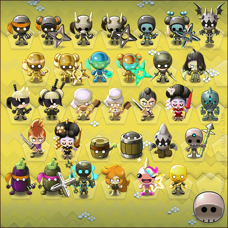
One of the most important parts of the game was to create the numerous character variations. It was very important because the ‘soft’ currency available in our game only allows you to unlock and buy those customizations. I designed more than 40 different skins!!
PILE OF BONES.
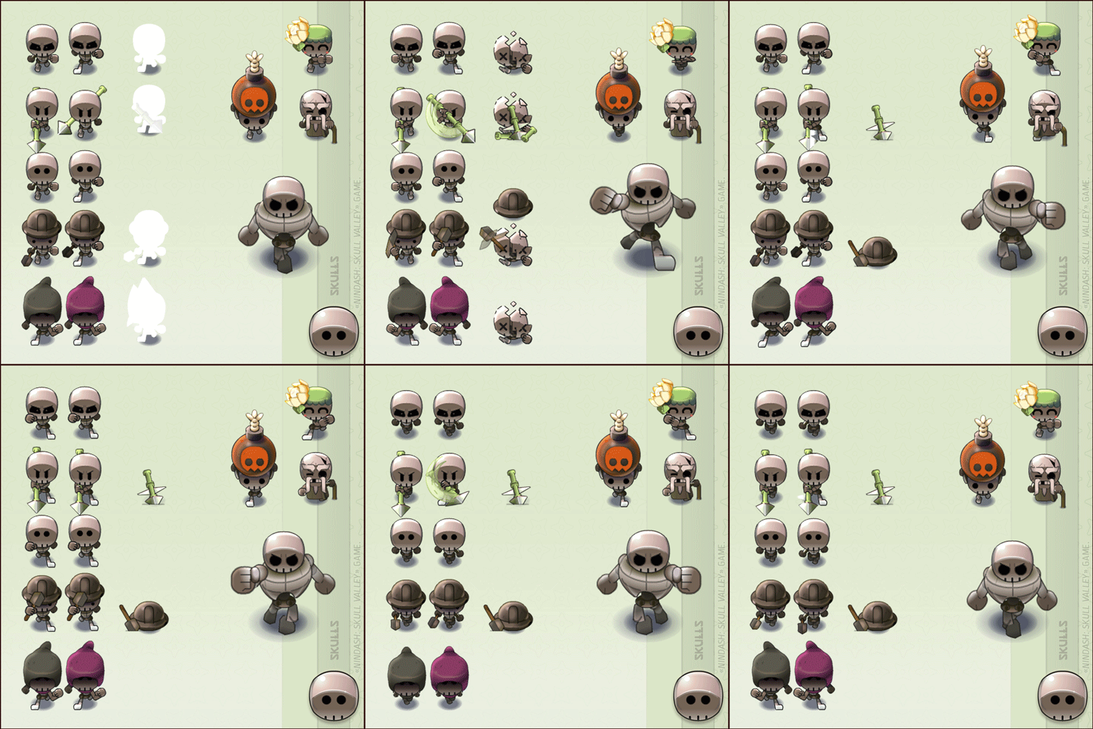
In NINDASH, enemies are skulls hordes which attack from the top of the screen. We had a lot of fun and ideas with skulls. We achieved to design 11 various units for the entire game.
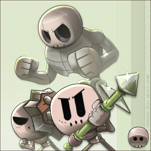
The art style I defined allowed me to quickly draw a dozen skulls illustrations. It took between 4 to 7 hours of work for each graphic, depending on its complexity.
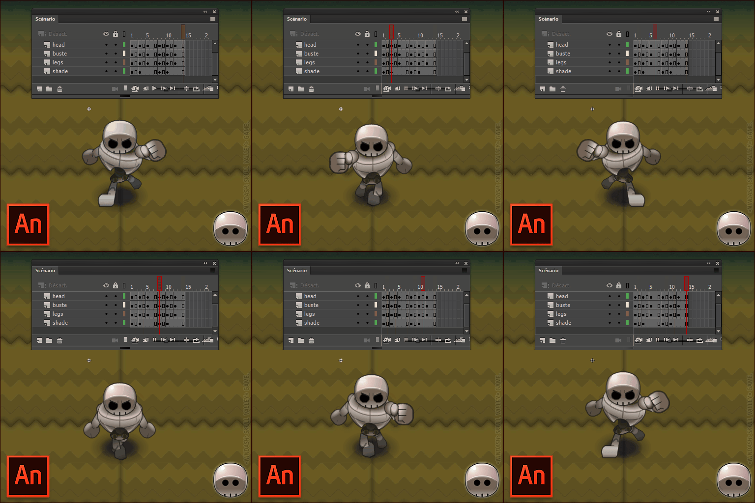
Concerning animation, I used the software Adobe Animate. I created simply stylized cut-animations, with the minimum of frames. It’s more than enough to create an illusion of movement. NOTE: I’m not used to automatic interpolations. In the end, I exported my animations in image sequences (.PNG) which were re-imported in Unity.
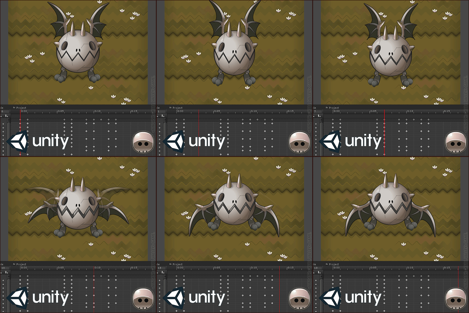
A technical issue has arisen when I was drawing the first Boss. His big size did not allow to use the previous technique: the generated sprite sheet would have been too big. Finally, I designed a ‘puppet’ of the Boss. Then, I learned in one day how to create efficient and dynamic animations directly on Unity.
ANIMATIONS/FX.
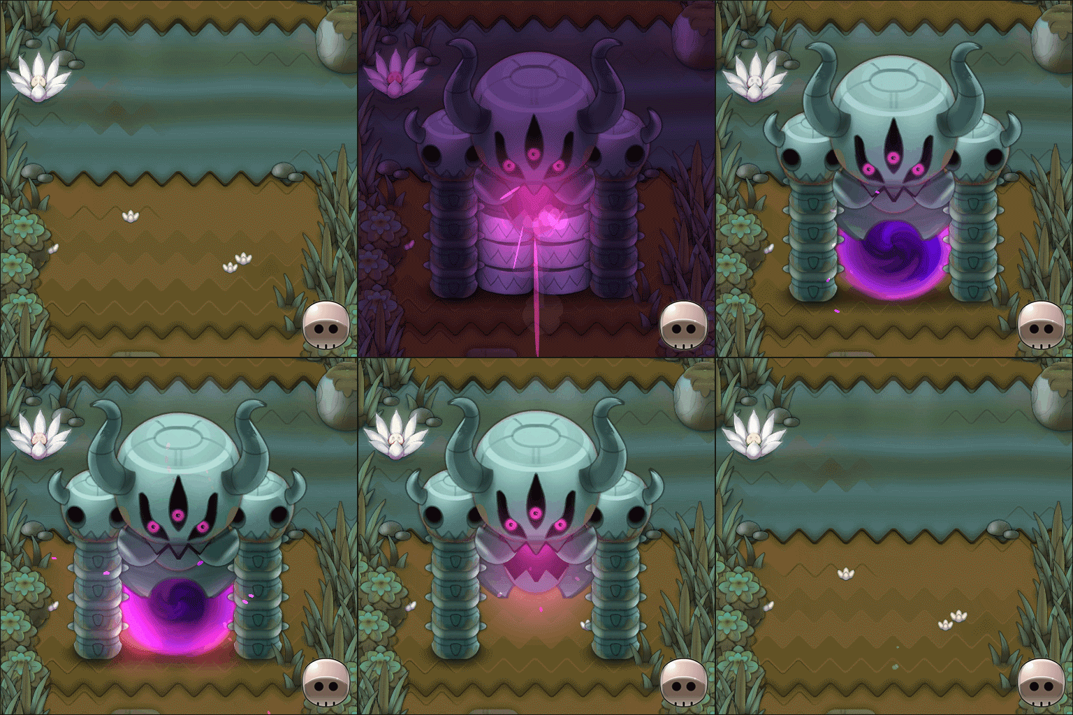
We had the chance to collaborate with Sylvain GUERRERO, a super talented and experimented technical artist. He played a key role in the creation of visual effects: FXs, shaders and complex animations. For instance, he worked on the animation of the Demon Door introduction, that he created using my background assets.
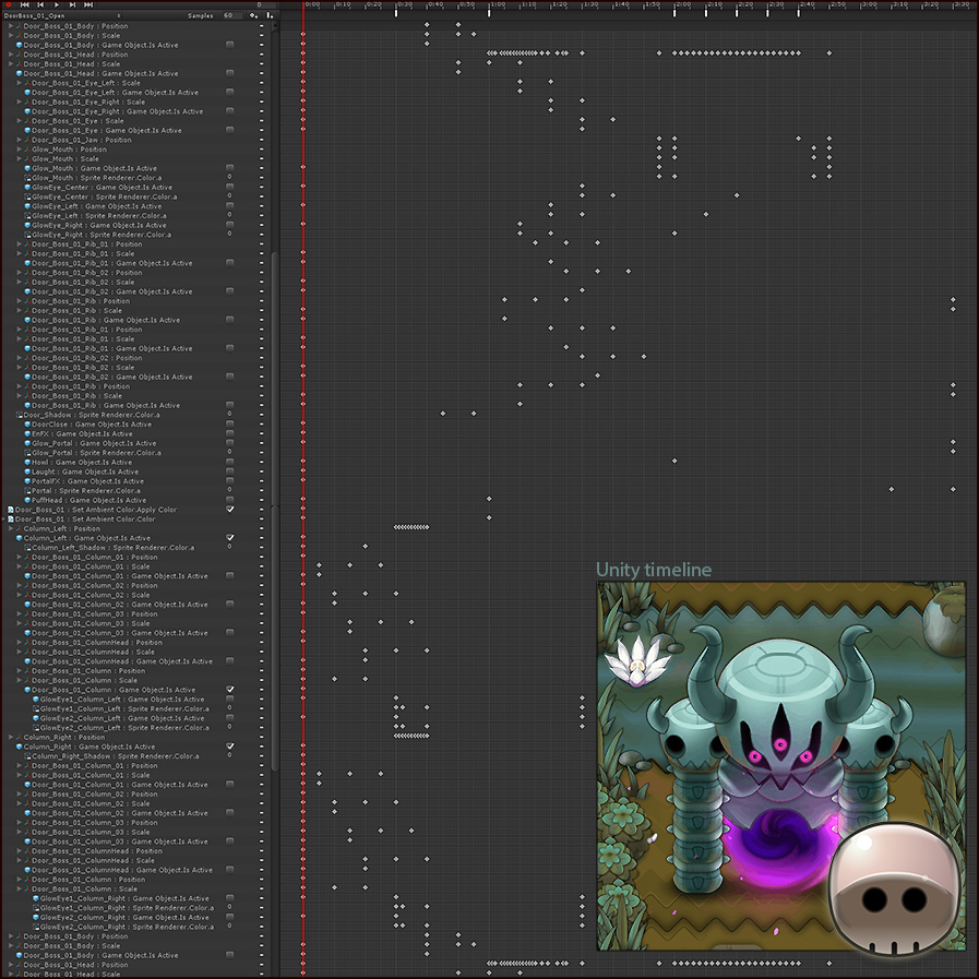
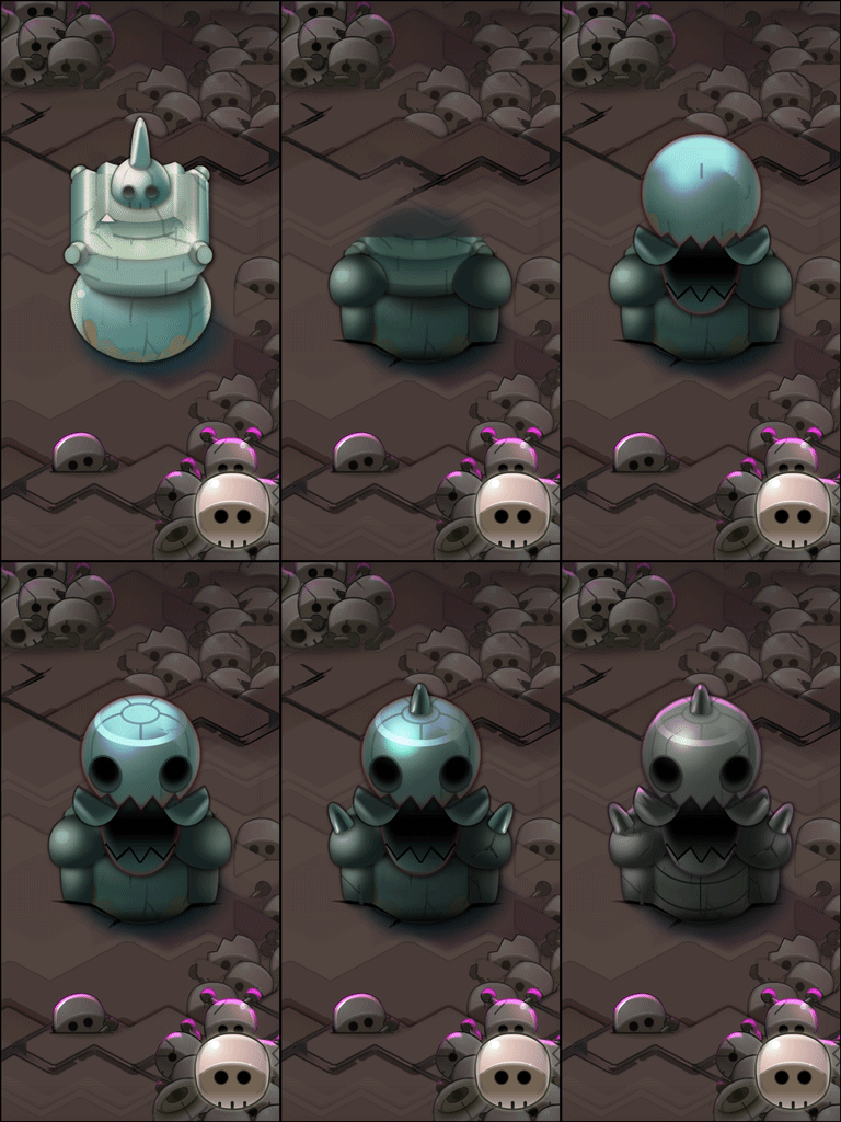
The animation of the Demon Door has been so much work… As you can see below on the Unity timeline, the original file is composed of dozens of layers!
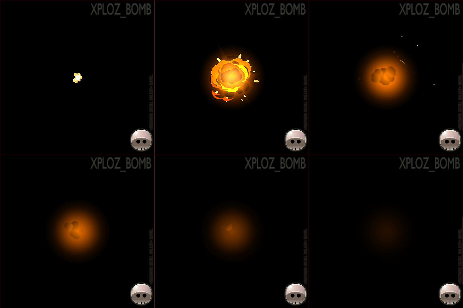
Sylvain also helped us to create dozens of FXs: highlights, explosions, dash trails, enemies deaths, bosses attacks, etc.
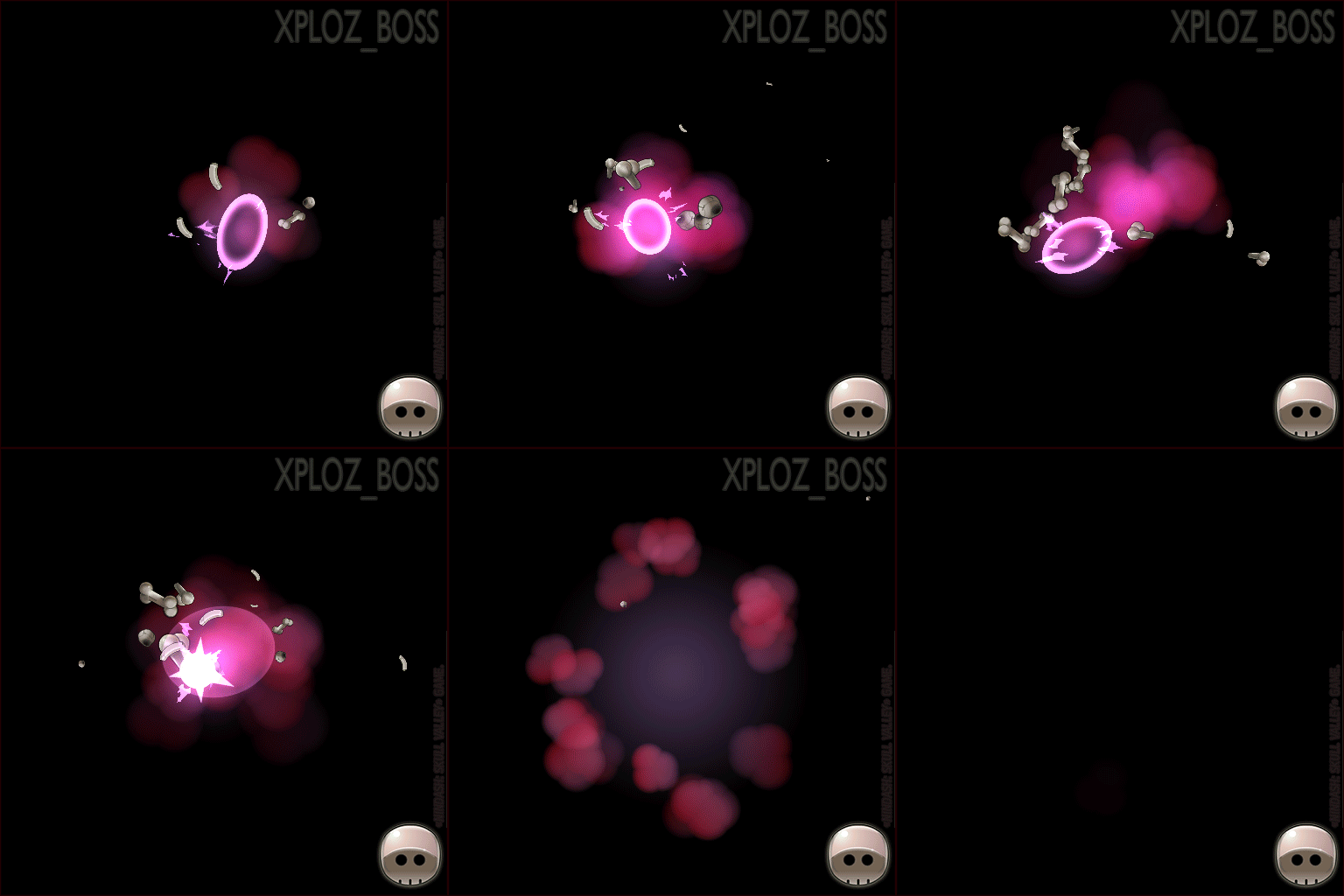
FXs are composed of several Unity particular systems, sometimes combined with shaders and specific effects.
BUTTONS AND BAMBOO.
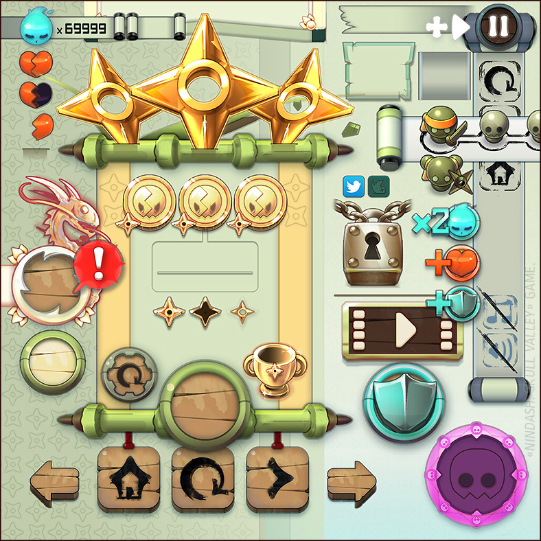
I knew that User Interface would need time. In NINDASH, there aren’t so many interfaces: HOME, MINIMAP, COLLECTION, In-game HUD. Nevertheless, I spent one third of the production time only on the User Interface design and feedbacks!!
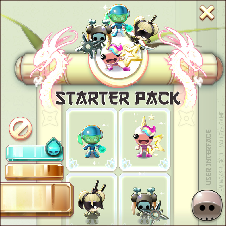
Even worse, we had to add a lot of pop-ups at the last time as the RATE pop-up, the STARTER PACK pop-up, the RELOAD Shop pop-up, the Apple LEADERBOARD pop-up, Gwaaaaaaaaah!
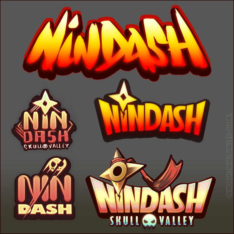
The logotype is always very important for the identity of a game. We had the chance to collaborate with François HOUSSIN, a veteran art director who already designed several logotypes for various Ankama games.
MUSIC.
The fabulous musics of NINDASH were composed by the talented Pierre-Jean BEAUDOUIN.
SOUND-DESIGN.
↓ Sound-design is also a very important part in the player immersion. It was made by the talented Grégory DESMURS. Let’s listen to the following audio file to discover a part of his work on NINDASH:
ECONOMIC MODEL.
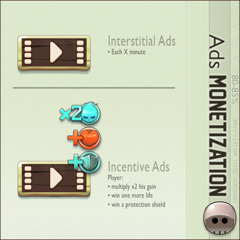
NINDASH: Skull Valley game economic model is very topical. Nowadays on mobiles, most players DON’T want to pay a cent to play. It’s a (sad) fact. The most common economic model is Free-to-play, with ads.
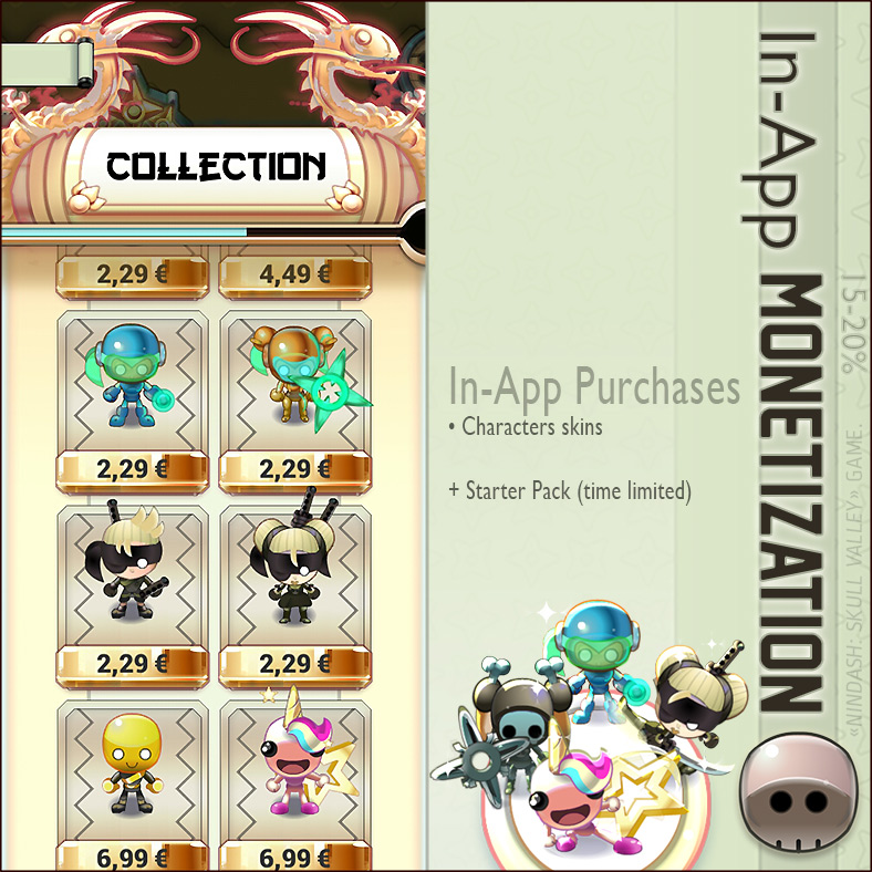
We added In-App purchases: we choose to sell a few exclusive character skins next to a not-too-aggressive ads monetization.
WHAT WENT WRONG.
For more than 10 years I’ve been trying to create a small video game next to my work, and it always failed for various reasons. The release of NINDASH sounds like a victory for me!
Creating a video game is always about solving what went wrong, it’s about constant adaptability. Nothing was dramatically wrong!!
WHAT WENT RIGHT.
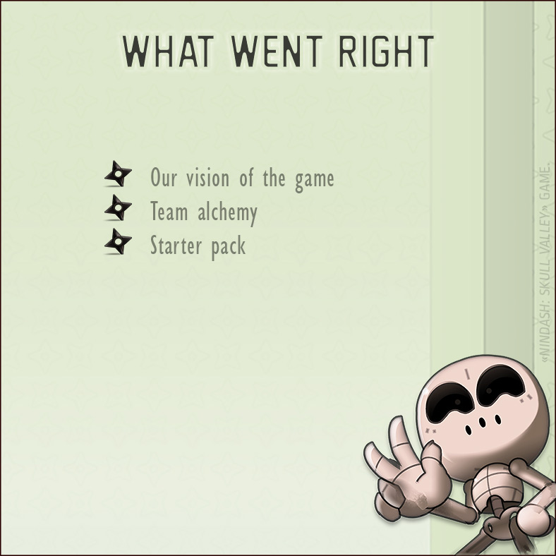
• We had a good idea of the game, and were efficient: we kept the most part of what we worked.
• Team alchemy. Each of us has his own specialty and we respected each other’s part. However, we were very demanding and often discussed the global aspects like game-design, game-feel or User eXperience.
• At the beginning, I had doubts about it… but finally, it was a brilliant idea to create a Starter Pack.
WHAT WE CUT OFF.
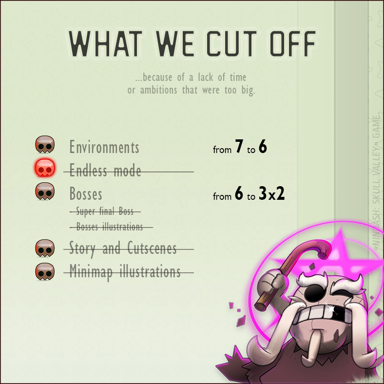
3 months is a really short deadline for a video game project. In the middle of the production, we decided to reduce the specter of our ambitions and we cut off a few things:
• We kept 6 environments on 7… but 3×2 is still good yeah!
• We didn’t complete the ENDLESS mode. It could have been a great mode but to develop and balance it well we would have needed much more time. We chose to focus on the STORY mode.
• We reduced the number of Bosses from 6 to 3. To design properly a good BOSS, you need at least two weeks of work: design, animations, integration, gameplay, patterns, test, debug, additional feedbacks, spells and FX, test/debug, balance, test/debug, etc. The main regret was to give up the Final BOSS. It was literally impossible to spend time on it during the final rush. We would rather polish the game and the Bosses that were already designed than add a final sucked Boss!
• Another important thing we sacrificed is the scenario. :'(
In the beginning, I had a nice idea about the narrative aspect of the game, I wanted to create an opening cutscene which explains the role of the main characters, using 5 illustrations. I drew the first, then a piece of the second. Then I didn’t found time to finish, overworked by the requirements of the core-game. It wasn’t conceivable to spend 2 weeks (1/6 of the production) on a skippable cinematic, which would have not even represented 30 seconds in the game. I also had cool ideas for the penultimate and final bosses. But as I said previously, we had to skip this part. «Nothing is lost but everything is transformed»: we finally used the illustration I did for the ending cinematic, which was integrated at the very last moment.
• Another main regret is about the Minimap. My original intention was to draw a more immersive and colorful illustration for the player progression in the NINDASH world. Due to a lack of time, Adrien finally reused my background assets to create the world minimap.
WHAT WE DIDN’T EXPECT
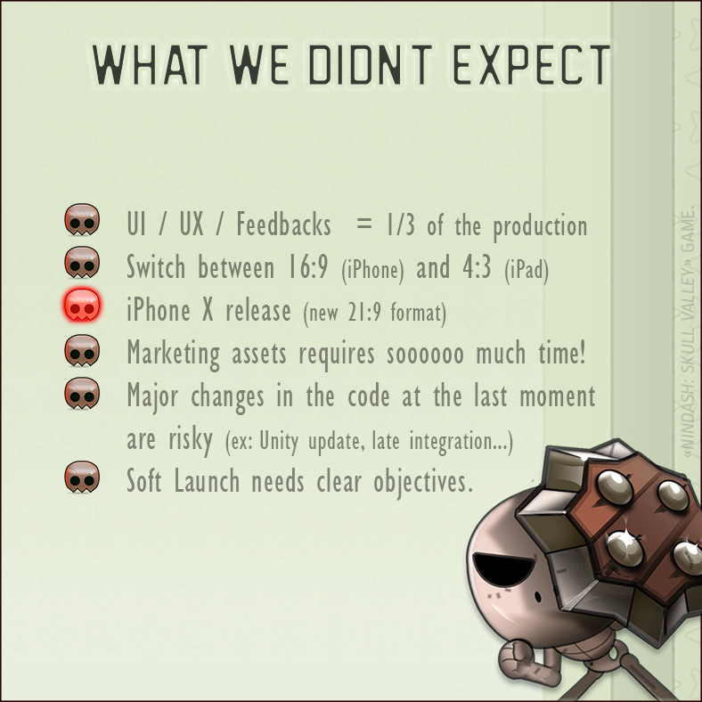
• I wasn’t expecting to work this hard on User Interface design and feedbacks. Damn, it was so long, I devoted one-third of the production time to that.
• The most difficult part was to switch all the time between 16:9 (mobile) and 4:3 (iPad) size. That was a problem because we had to choose a size to prioritize, to the detriment of the other. We focused on the mobile format. It was particularly difficult for User Interface design. Sometimes it was well-polished on 16:9, sometimes better on 4:3. We had to do some compromises.
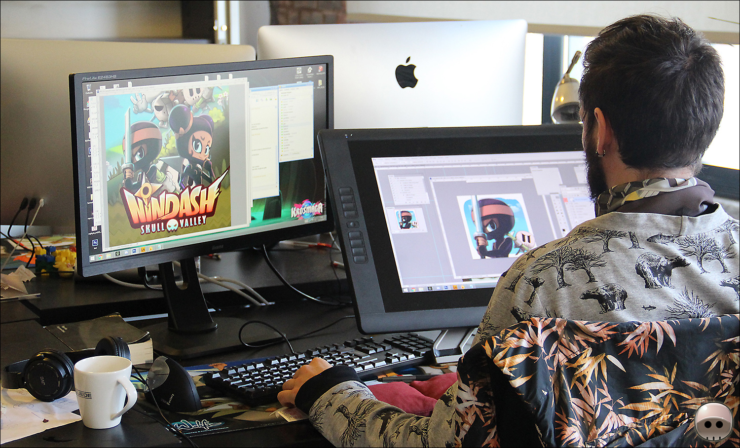
• I spent one entire week working only on the game icon and store pictures!

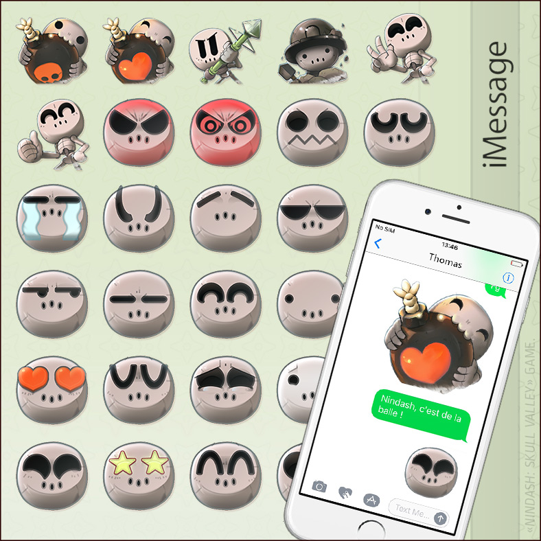
I also designed several original NINDASH stickers for iOS iMessage app, I was really inspired by my super fun skull!
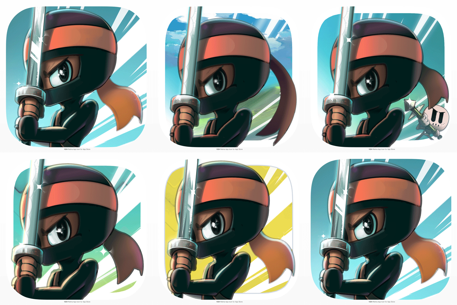
Designing a Store Icon is always a big challenge because it’s the initial contact with potential players. I did 20 iterations on the NINDASH Store Icon to obtain the optimal clarity.
• We integrated the final Splash screen and the ending cinematic in the last two days!! It was really late.
• At the last moment, Thomas was required to do a critical Unity update to be able to add Apple stickers app’. A pretty bad idea because all the game graphics crashed! Fortunately, he quickly found a solution.
• The most unexpected was the iPhone X release, just a few days before the Soft Launch of our game. iPhone X is a very particular device with a larger screen and a notch on its top. We were lucky because one of our early testers had this new iPhone (thank you Letsuky); he told us that part of User Interface was cropped and the game wasn’t optimized on this new device. It was very problematic because we wanted to be highlighted by Apple. Thus Adrien had to rework and lengthen all 90 level backgrounds of the game while Thomas reoptimized all User Interface at the very last moment!
SOFT LAUNCH.
If you don’t know what a Soft Launch is, check the following Wikipédia definition:
” A soft launch is a preview release of a product or service to a limited audience prior to the general public. Soft-launching a product is sometimes used to gather data or feedback regarding its acceptance in the marketplace, prior to making it widely available during an official release. […] ”
Apple really likes Soft Launches for app store games. It is really important to test your game, even if you have a low number of players. Let’s check this great Soft Launch guide on SoftLaunch guide on pocker.biz if you are interested.
10th November: Apple validation of the game.
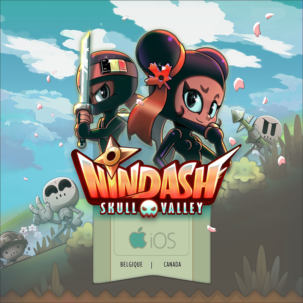
28th November: Publication of the game (Belgique/Canada)
5th January 2018: Apple did a request for App Store Promotional Artworks. Surely this was a good sign for a highlight of our game!
It was difficult to analyze by ourselves our Soft Launch, it’s much more a matter of marketing. With my very basic levels of marketing, I noticed it was quite difficult to target Belgian and Canadian audience. Our newsletters reach was pretty low (11,48% opened, barely 1,56% clicked), Facebook reach was worst and worst, etc. We had around 1500 players… It was not enough!
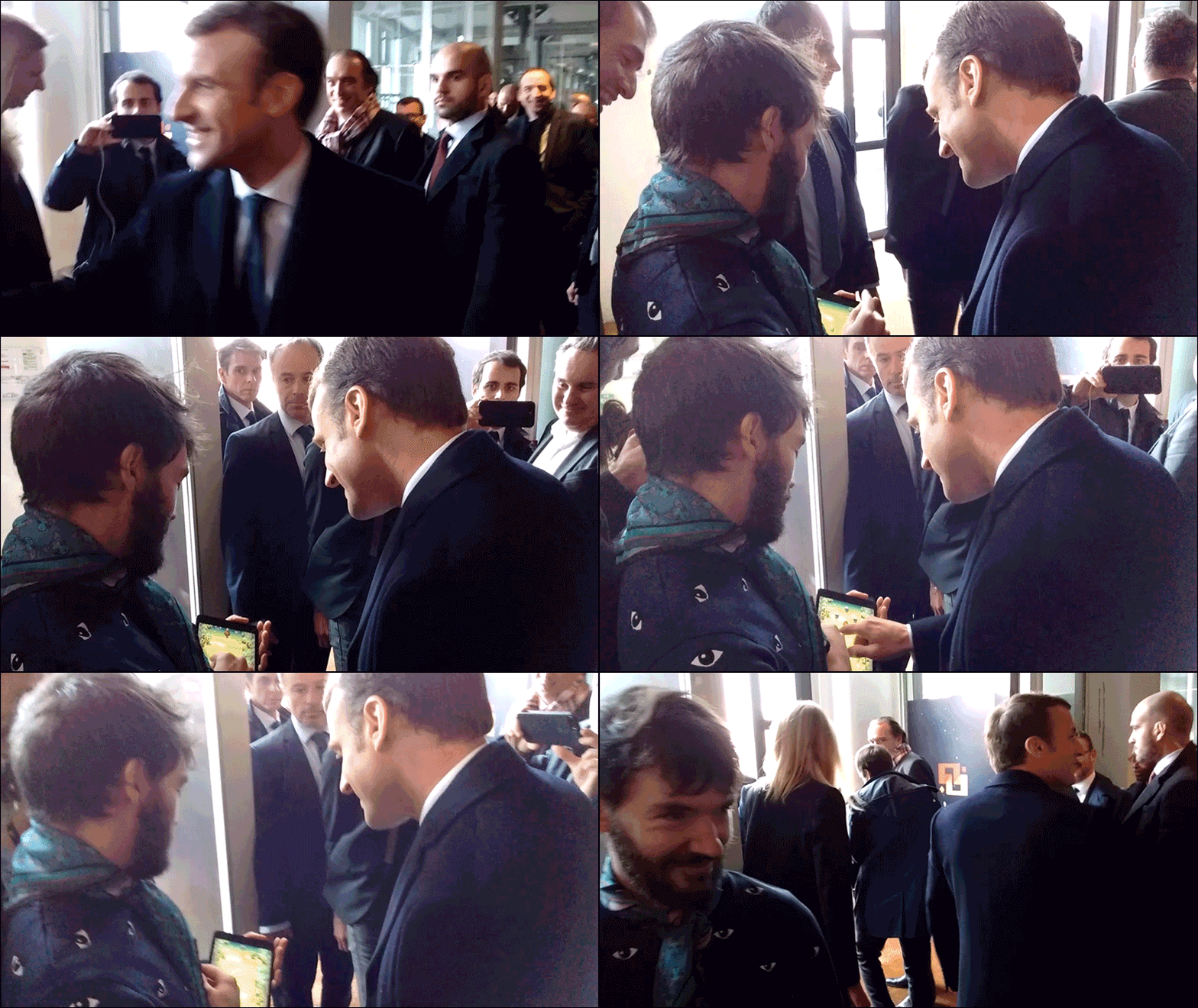
During his visit at ANKAMA Studio, I intercepted the President. Emmanuel Macron was one of our best beta-testers. It was great to see him play well, even if he doesn’t seem to be a super gamer!
IMPROVEMENT PATCH:
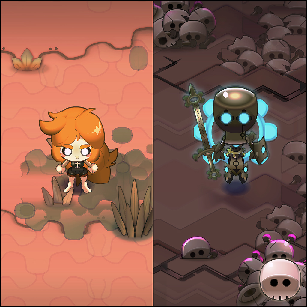
The NINDASH team worked 3 days to make the first patch, to enhance the beginning of the game and do a few bugfixes.↓ I took advantage of this time to add 4 Ninja skins including a tribute to my two favorite WAKFU series characters: NOX and ELELY.
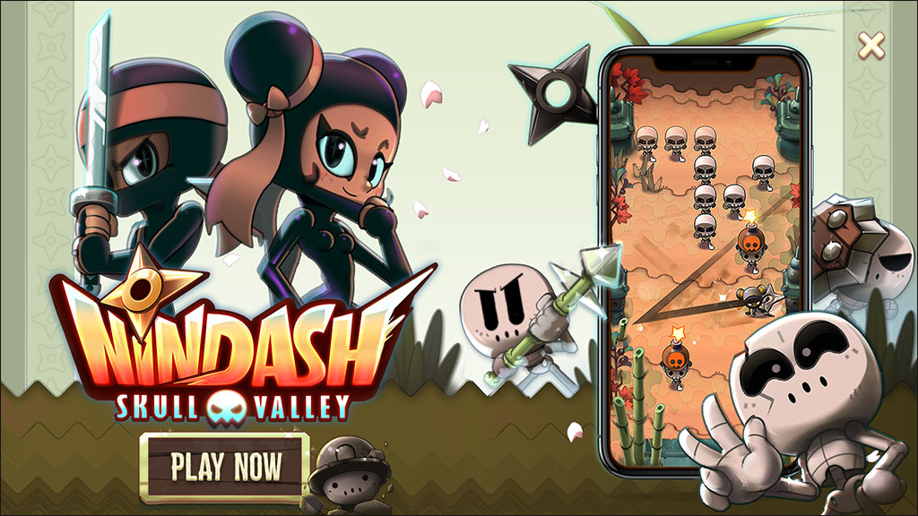
I also created some other ads for the game in landscape and portrait format (4×3 + 16×9).
TEST/DEBUG/TEST/DEBUG…
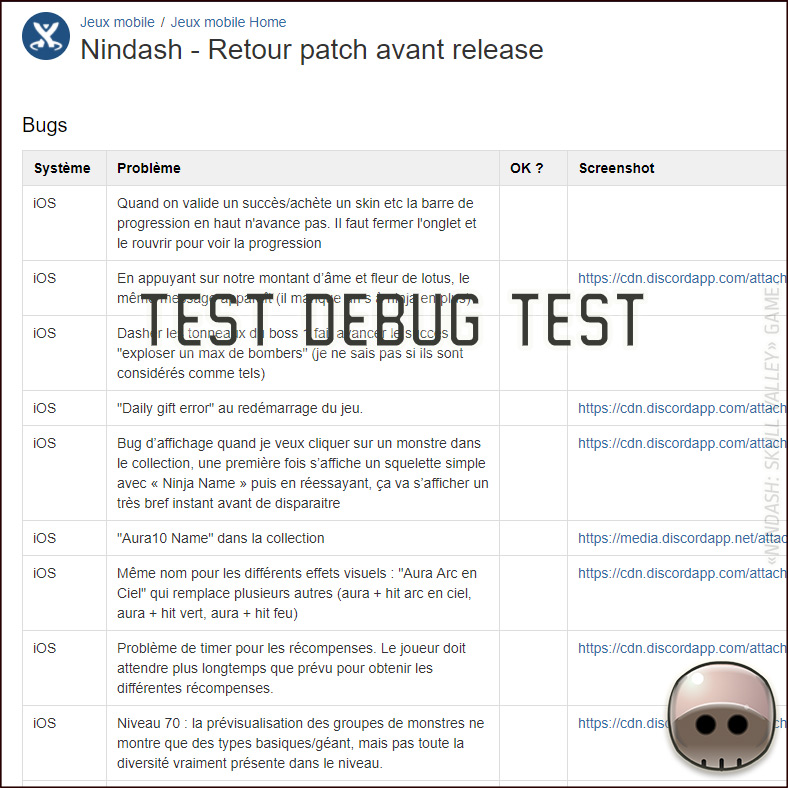
A very important thing in game development I didn’t speak about: testing. We are lucky enough to have a great community. A dozen very invested players of other Ankama’s games really helped us to improve the game, by giving us some feedbacks or by finding bugs. We created a dedicated Discord to talk to them.
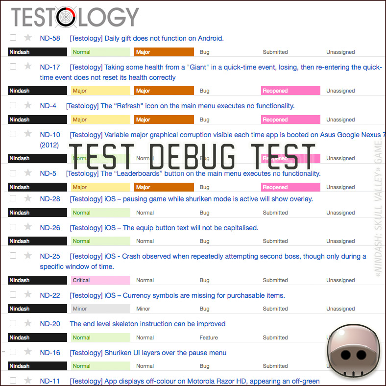
We also work with TESTOLOGY: we always send them our -build- before major stores submissions. They found really constructive and critical feedbacks/issues about the game.
RELEASE.
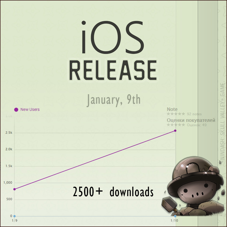
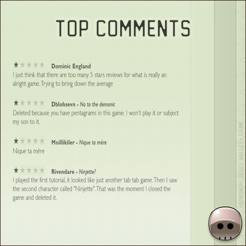
We released our game on the 9th of January. We had the support of several ANKAMA social networks, it was a good way to start, particularly on the French and Russian Apple Stores in which we quickly had lots of players comments and good reviews, with 5✩ notes!! Even so, we only had 2500 downloads… Almost nothing!
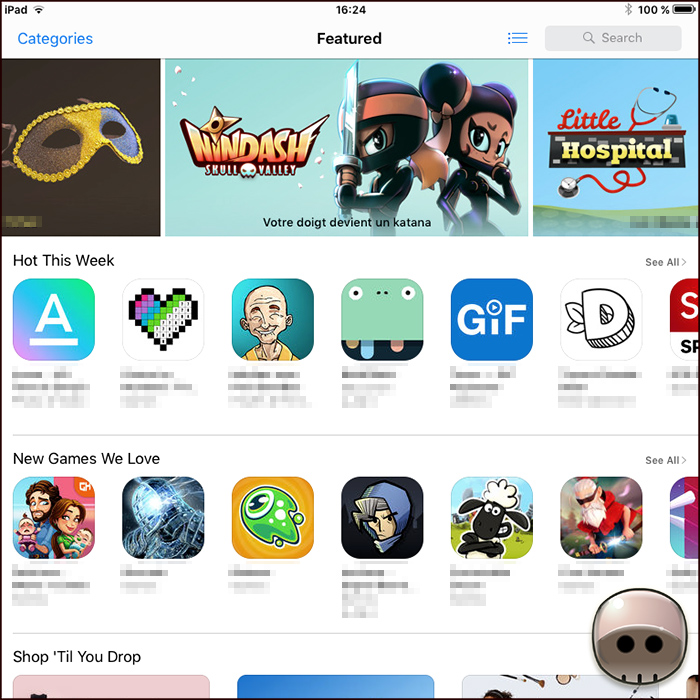
We had Apple Store highlights on the 11th of January evening. We got the Grail: the ‘Featured‘ banner in most European stores (FR/UK/IT/DE/ES/etc), and in China, Japan, Russia, etc. It returned a huge visibility for our game: between 75-100 downloads per minute the first days.
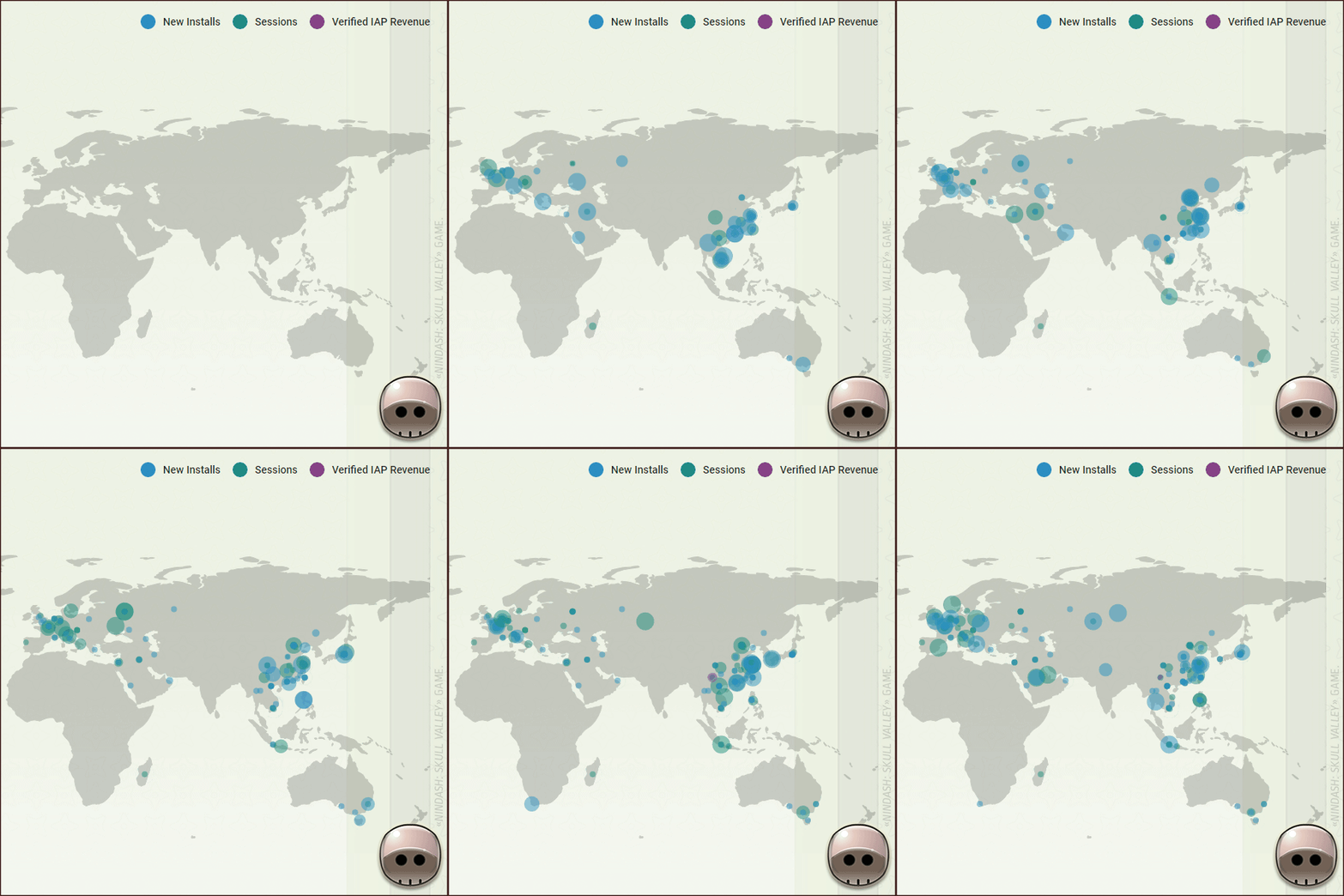
Then, I spent my weekend doing data-porn, by watching points and statistics on Unity Analytics map… It was both freaking and fascinating!
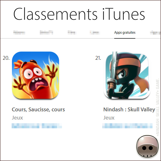
It’s interesting to analyze the French Apple Store. We fought for the Free App’ TOP 20 against ‘Run, Saucage, Run!‘, we went to the 8th place. Finally, we lost the battle. It’s amazing how a few video game editors are able to climb their app’ on Top only using users acquisition: it’s more powerful than our natural referral with Apple highlights!!

We were very happy with the launch. After one week, we finally had very good rates on very important markets like the United States and China. I’m very proud of it! We, fortunately, had between 8-25 downloads per minute the week after, thanks to natural indexing and Apple residual highlights (JP/UK/NL/SE).
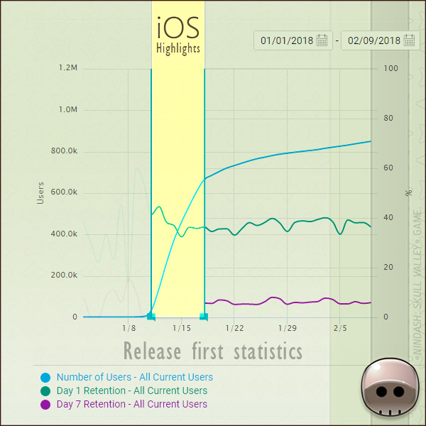
The huge amount of game downloads only happened thanks to Apple Highlights. Without this support, the game would probably have been a flop!
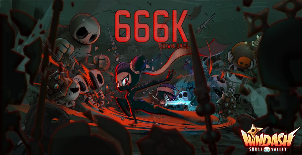
We quickly reached 666666+ downloads of our game on iOS. I drew on my free time a promotional illustration to celebrate it! Yeah!!
NINJA & ANDROID.
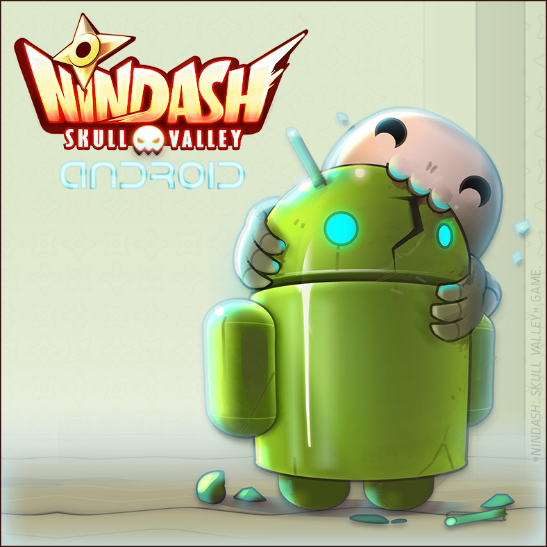
A lot of players requested for it: after a few weeks of testing, we also released our game on ANDROID, the 23rd January.
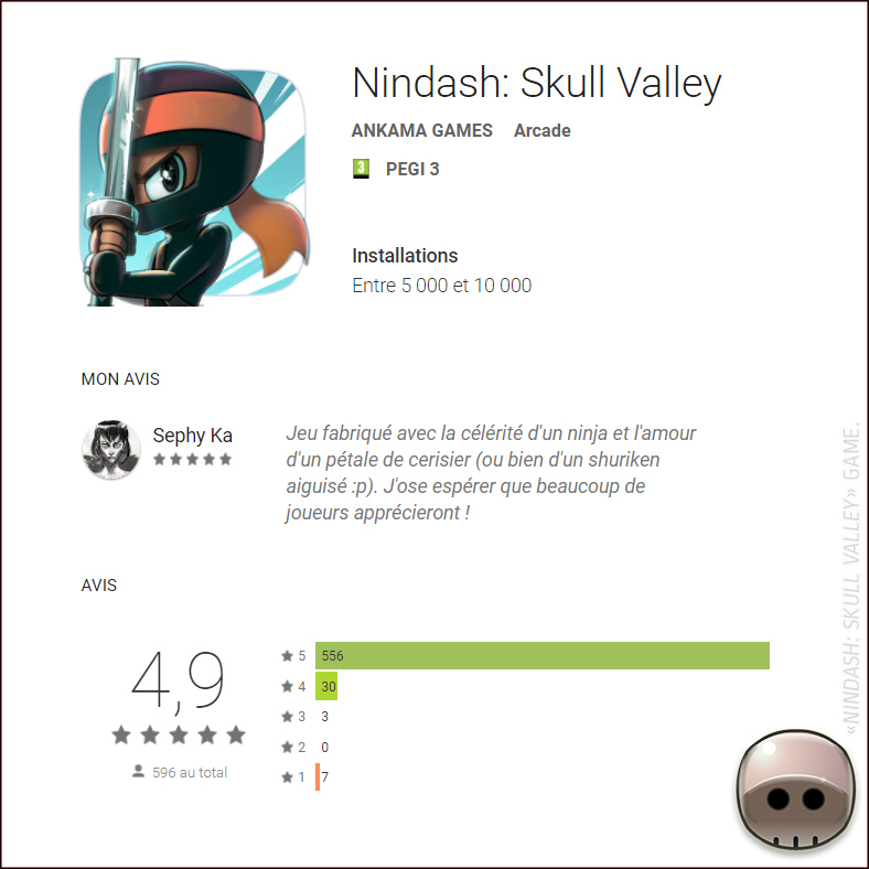
As expected, the Android launch was very quiet. Two reasons: we hadn’t Google highlights and we didn’t use players acquisition. We still had really good players reviews on the store. In comparison, the previous ANKAMA mobile game DRAG’n’BOOM also had a quiet launch with finally more than 2M+ players after months. I hope, it’ll be the same for NINDASH.
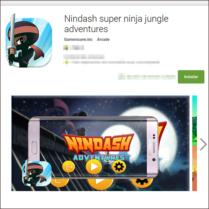
Android store is a very different environment than iOS. Games aren’t verified, often hacked. Game clones quickly appear. This also happened with our game.

I did it for the 5000, then the 10000. I bought a brioche for my workmates to celebrate the 50000+ downloads of our game on Android. Next brioche for the 100000 haha!
FIRST PATCH.
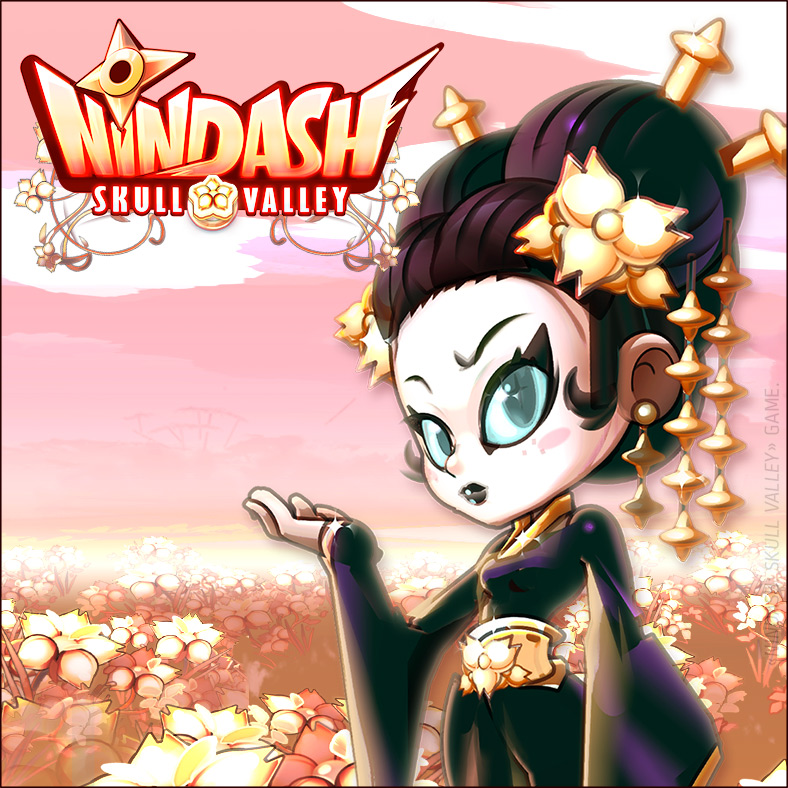
It’s highly recommended to do a game update with new contents 6 to 8 weeks after a release. So, we worked on the first update in February.
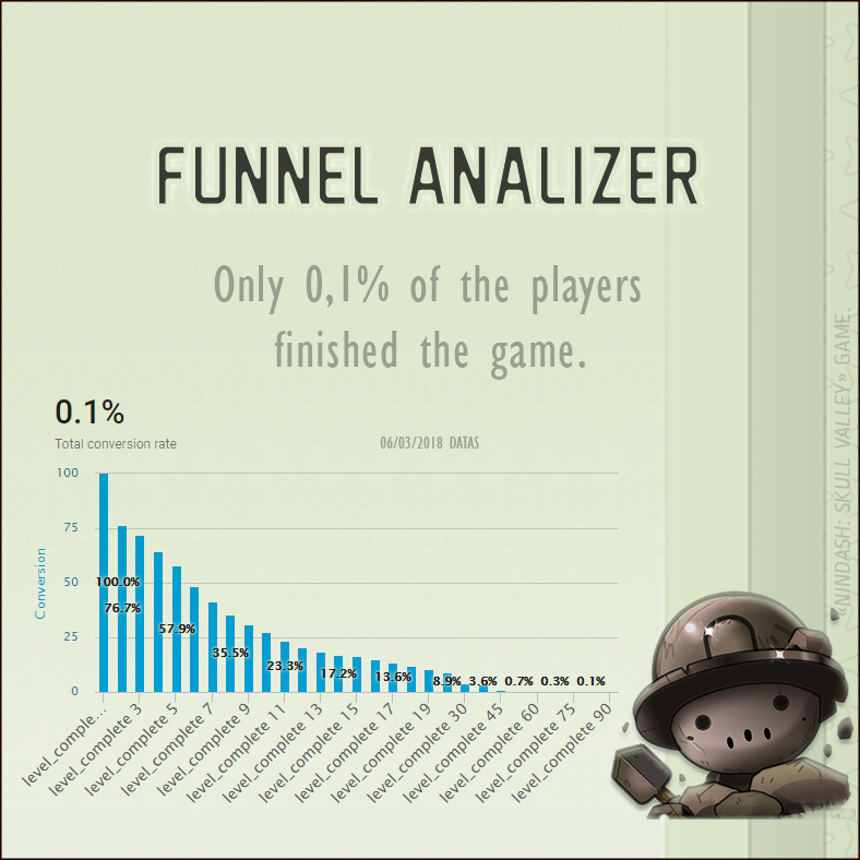
About Nindash, the logical approach would be to create new levels or bosses… Hell no! Using our data, we quickly realized that only 0,1% players finished the game. So we decided to add early-players contents!
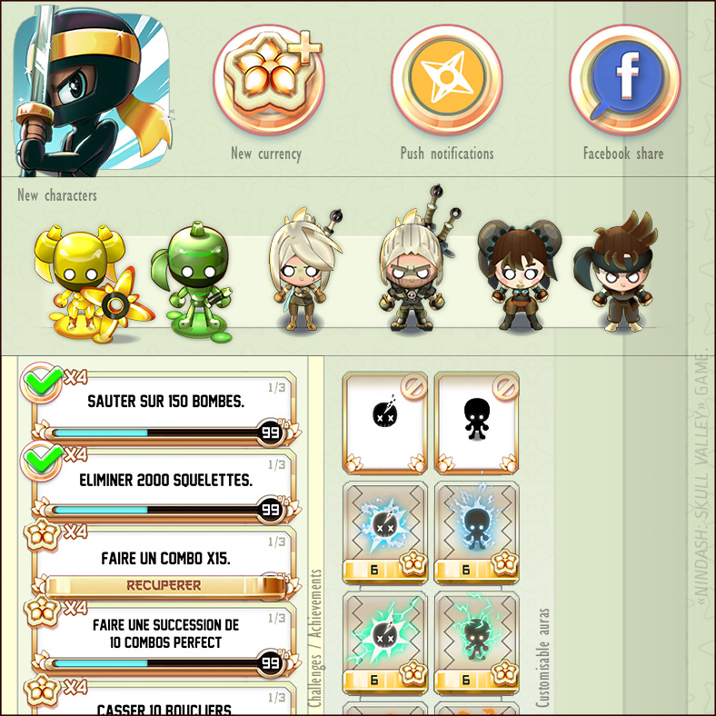
We introduced Lotus Flower rewards that can be obtained every day. Kicking off a new era of legendary fighters, unique characters and customizations can now be unlocked by completing a series of new challenges. We also added push notifications and a Facebook share feature, which was tricky for our developer, because it was very difficult to test these features.
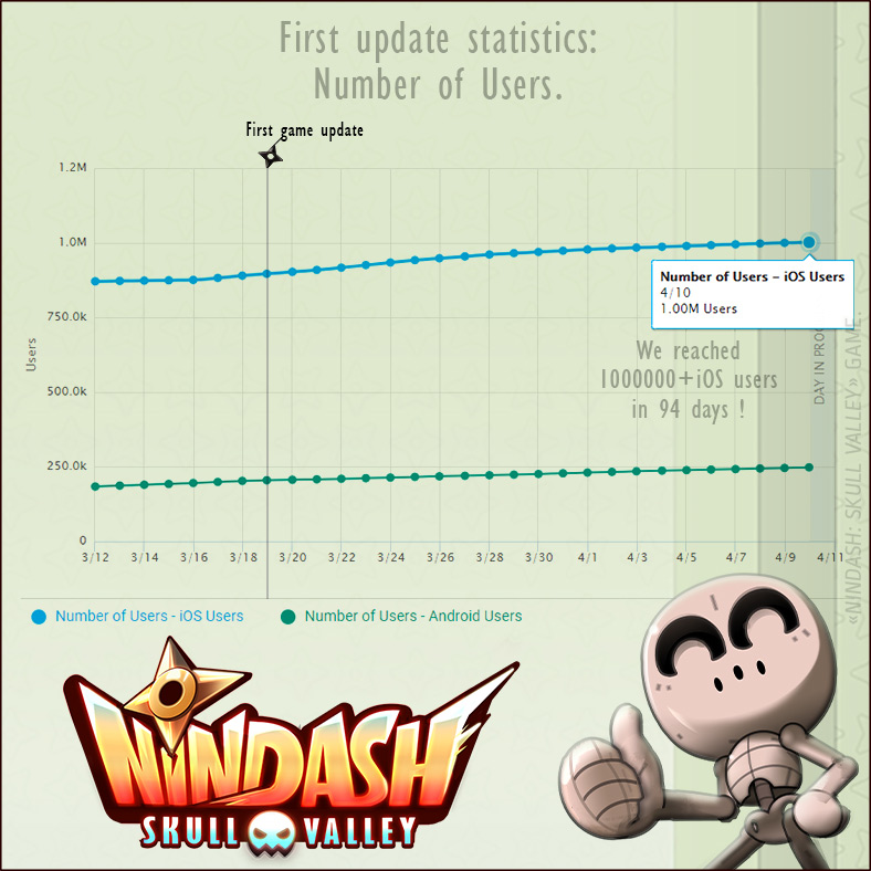
The new update was a good decision. It was curious because iOS and Android didn’t react the same way. On iOS, we suddenly won a lot of daily new users, probably thanks to a referral of new updated applications. On Android, conversely, our daily new users amount decreased. I really don’t know why… My personal theory is that our update disturbed Google Store referral algorithms which were previously pretty good for our game.
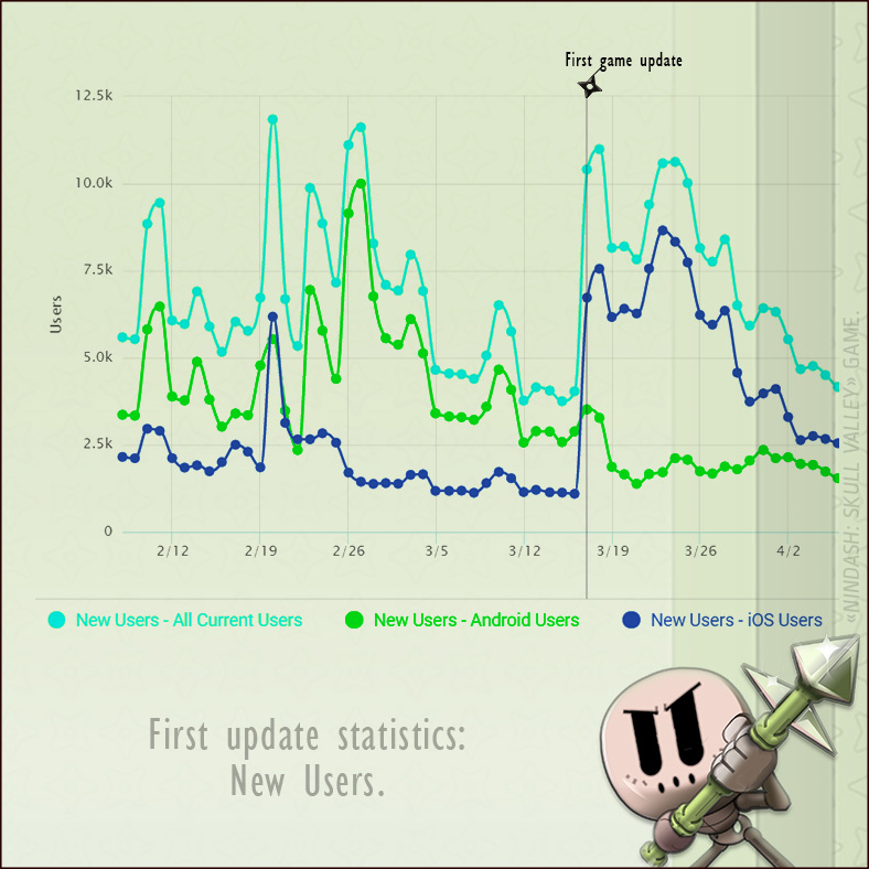
The really positive point is that our update really improved the game retention, probably because the game was more consistent for new players!
I also drew another promotional illustration on my free time!
ALMOST THE END.
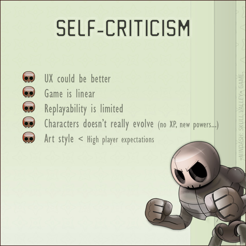
Impossible to achieve a post-mortem without self-criticism. We learned a lot and our game has its weaknesses:
THANKS.
Thanks to the lovely Laure POINTEREAU who took her time to help correcting this Post-Mortem.
I would like to thank Anthony ROUX and Camille CHAFER for the confidence they gave to us.
I would like to thank all the early testers who helped us finding bugs and improving the game: Lopaul, Naemis, Seyif, Letsuky & his iPhone X.
RESOURCES.
• GAMAKNA: SHURIK’EM UP! [FR/EN]
• GAMAKNA: NINDASH « Les météores, c’est nul ! » / « Meteors, that’s boring! »
• NINDASH on Touch Arcade / TIGSource / AFJV.
• NINDASH Game of the Week on PocketGamer.biz [twit]
• NINDASH Tips & Strategy Guide on Touch, Tap, Play
• NINDASH OpenClassrooms Devlog. [FR]
• NINDASH All iOS Featured.


